-
CSS Tutorial
- introduction-to-css
- what-is-css
- css-syntax
- css-selector
- how-to-add-css
- inline-css
- internal-css
- external-css
- css-comments
CSS Properties
- css-background
- css-border
- css-border-radius
- css-border-collapse
- css-border-spacing
- css-display
- css-cursor
- css-buttons
- css-float
- css-font
- css-font-size
- css-font-family
- css-font-weight
- css-font-stretch
- css-colors
- css-hover
- css-important
- css-background-color
- background-attachment
- background-size
- css-line-height
- css-margin
- css-opacity
- css-filter
- css-images
- css-overflow
- css-padding
- css-position
- css-vertical-align
- css-white-space
- css-width
- css-height
- css-word-wrap
- box-shadow-css
- css-text-shadow
- css-text-transform
- css-outline
- css-visibility
- css-counter
- css-clearfix
- css-icons
- css-justify-content
- css-text-decoration
- css-lists
- css-nth-selector
- css-sticky
- css-background-clip
- css-checkbox-style
- css-letter-spacing
- css-navigation-bar
- css-overlay
- css-root
- css-specificity
- css-text-indent
- css-text-stroke
- css-zoom
- css-order
- css-descendant-selector
- css-calc()
- css-clip
- css-clip-path
- css-background-blend-mode
- css-radio-button
- superscript-subscript
- css-text-effects
- css-text-align
- css-variables
- page-break-before-property
- page-break-inside-property
- page-break-after-property
- css-content-property
- css-word-spacing
- css-object-fit
- css-object-position
- css-columns
- css-pointer-events
- css-hyphens
- css-font-variant
- css-left-property
- css-right-property
- css-bottom-property
- css-top-property
- word-break-property
- css-max-height
- css-max-width
- css-min-height
- css-min-width
- css-border-image
- css-cubic-bezier
- css-quotes
- css-transform-origin
- css-resize
- css-text-overflow
- css-writing-mode
- css-background-origin
- css-text-orientation
- css-transition-delay
CSS Advance
- css-animation
- css-@keyframes-rule
- css-pseudo-classes
- css-pseudo-elements
- css-radial-gradient
- css-translate
- css-gradient
- css-z-index
- css-minify
- css-loader
- css-units
- css-combinators
- css-masking
- css-transition
- css-tooltips
- css-tooltip-animation
- css-arrow
- css-flexbox
- css-flex-property
- flex-basis-property
- flex-grow-property
- flex-shrink-property
- flex-flow-property
- css-@media-query
- css-2d-transforms
- css-3d-transforms
- css-aural-media
- css-user-interface
- css-pagination
CSS Design
CSS Questions
- how-to-center-a-table-in-css
- how-to-center-text-in-css
- how-to-add-background-image-in-css
- how-to-vertically-align-text-with-css
- how-to-underline-text-in-css
- how-to-add-border-in-css
- how-to-align-images-in-css
- how-to-align-text-in-css
- how-to-center-images-in-css
- how-to-bold-text-in-css
- how-to-center-a-button-in-css
- how-to-change-background-color-in-css
- how-to-change-the-font-size-in-css
- how-to-change-image-size-in-css
- how-to-change-link-color-in-css
- how-to-change-text-color-in-css
- how-to-use-the-css-grid
- how-to-use-google-fonts-in-css
- how-to-wrap-text-in-css
- how-to-italicize-text-in-css
- what-are-the-uses-of-css
- what-is-a-css-grid
- how-to-change-the-font-in-css
- how-to-position-an-image-in-css
- how-to-remove-bullet-points-in-css
- difference-between-html-and-css
- css-transition-opacity
Miscellaneous
CSS MCQ
Interview Questions
CSS border-image propertyThis CSS property defines an image to be used as the element's border. It draws an image outside the element and replaces the element's border with the corresponding image. It is an interesting task to replace the border of an element with the image. The border-image property can be applied to all elements except the elements of the internal table (such as tr, th, td) when border-collapse is set to collapse. It is the shorthand property for border-image-source, border-image-slice, border-image-width, border-image-outset, and border-image-repeat. We can set all these properties at once using the border-image property. If any of the values are not specified, then they set to their default values. The default value of this property is: SyntaxThe values of this property are tabulated as follows.
Now, let's see some of the examples to understand how to set the border-image using the border-image property. ExampleIn this example, we are replacing the border of the paragraph elements with the image. In the first paragraph, we are specifying the single value (i.e., round) of the border-image-repeat property, whereas in the second paragraph, we are specifying two values (round, stretch) of it, the first value for the horizontal sides and second value for the vertical sides. Output 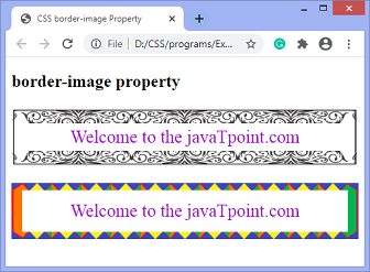 We can also specify the gradient as the border image. Example - using linear-gradientIn this example we are using the linear-gradient and repeating-linear-gradient as the border image of the paragraph elements. Output 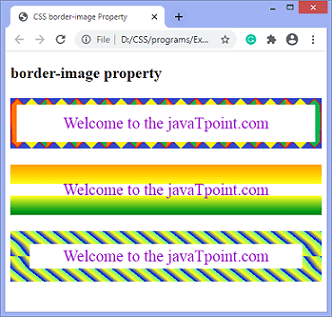 Example - using radial-gradientIn this example, we are using the radial-gradient as the border image of the paragraph elements. Output 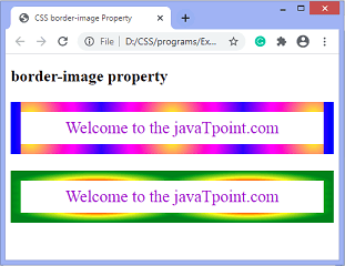
Next TopicCSS cubic-bezier() function
|