-
CSS Tutorial
- introduction-to-css
- what-is-css
- css-syntax
- css-selector
- how-to-add-css
- inline-css
- internal-css
- external-css
- css-comments
CSS Properties
- css-background
- css-border
- css-border-radius
- css-border-collapse
- css-border-spacing
- css-display
- css-cursor
- css-buttons
- css-float
- css-font
- css-font-size
- css-font-family
- css-font-weight
- css-font-stretch
- css-colors
- css-hover
- css-important
- css-background-color
- background-attachment
- background-size
- css-line-height
- css-margin
- css-opacity
- css-filter
- css-images
- css-overflow
- css-padding
- css-position
- css-vertical-align
- css-white-space
- css-width
- css-height
- css-word-wrap
- box-shadow-css
- css-text-shadow
- css-text-transform
- css-outline
- css-visibility
- css-counter
- css-clearfix
- css-icons
- css-justify-content
- css-text-decoration
- css-lists
- css-nth-selector
- css-sticky
- css-background-clip
- css-checkbox-style
- css-letter-spacing
- css-navigation-bar
- css-overlay
- css-root
- css-specificity
- css-text-indent
- css-text-stroke
- css-zoom
- css-order
- css-descendant-selector
- css-calc()
- css-clip
- css-clip-path
- css-background-blend-mode
- css-radio-button
- superscript-subscript
- css-text-effects
- css-text-align
- css-variables
- page-break-before-property
- page-break-inside-property
- page-break-after-property
- css-content-property
- css-word-spacing
- css-object-fit
- css-object-position
- css-columns
- css-pointer-events
- css-hyphens
- css-font-variant
- css-left-property
- css-right-property
- css-bottom-property
- css-top-property
- word-break-property
- css-max-height
- css-max-width
- css-min-height
- css-min-width
- css-border-image
- css-cubic-bezier
- css-quotes
- css-transform-origin
- css-resize
- css-text-overflow
- css-writing-mode
- css-background-origin
- css-text-orientation
- css-transition-delay
CSS Advance
- css-animation
- css-@keyframes-rule
- css-pseudo-classes
- css-pseudo-elements
- css-radial-gradient
- css-translate
- css-gradient
- css-z-index
- css-minify
- css-loader
- css-units
- css-combinators
- css-masking
- css-transition
- css-tooltips
- css-tooltip-animation
- css-arrow
- css-flexbox
- css-flex-property
- flex-basis-property
- flex-grow-property
- flex-shrink-property
- flex-flow-property
- css-@media-query
- css-2d-transforms
- css-3d-transforms
- css-aural-media
- css-user-interface
- css-pagination
CSS Design
CSS Questions
- how-to-center-a-table-in-css
- how-to-center-text-in-css
- how-to-add-background-image-in-css
- how-to-vertically-align-text-with-css
- how-to-underline-text-in-css
- how-to-add-border-in-css
- how-to-align-images-in-css
- how-to-align-text-in-css
- how-to-center-images-in-css
- how-to-bold-text-in-css
- how-to-center-a-button-in-css
- how-to-change-background-color-in-css
- how-to-change-the-font-size-in-css
- how-to-change-image-size-in-css
- how-to-change-link-color-in-css
- how-to-change-text-color-in-css
- how-to-use-the-css-grid
- how-to-use-google-fonts-in-css
- how-to-wrap-text-in-css
- how-to-italicize-text-in-css
- what-are-the-uses-of-css
- what-is-a-css-grid
- how-to-change-the-font-in-css
- how-to-position-an-image-in-css
- how-to-remove-bullet-points-in-css
- difference-between-html-and-css
- css-transition-opacity
Miscellaneous
CSS MCQ
Interview Questions
CSS cubic-bezier() functionIt is an inbuilt function in CSS that defines a Cubic Bezier curve. The Bezier curve is the mathematically defined curve used in 2D graphical applications such as (inkspace, adobe illustrator, etc.). This CSS function is the transition timing function, which is used for the smooth and custom transitions. It is defined by the four points (that are P0, P1, P2, and P3). The points P0 and P3 (called as anchors) are the starting and the ending points, and the points P1 and P2 (called as handles) are the middle points. For CSS Bezier curves, the points P0 and P3 are always in the same spot. P0 is at (0,0) that represents the initial state and initial time, and P3 is at (1,1), which represents the final state and the final time. This means that the parameters passed to the cubic-bezier() function can only be between 0 and 1. SyntaxThis CSS function accepts four mandatory numeric values. The value of x1 and x2 must be lies between 0 and 1, or the value will be invalid. If we pass the parameters that are not in this interval, the function will set to its default i.e., the linear transition that has the value cubic-bezier(0, 0, 1, 1). We can understand this CSS function by using the following illustration. ExampleThis function can be used with animation-timing-function and transition-timing-function property. Here, we are using the transition-timing-function property. Output 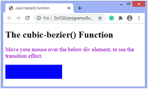
Next TopicCSS quotes
|