-
Python Tutorial
- python-tutorial
- python-features
- python-history
- python-applications
- python-install
- python-example
- python-variables
- python-data-types
- python-keywords
- python-literals
- python-operators
- python-comments
- python-if-else
- python-loops
- python-for-loop
- python-while-loop
- python-break
- python-continue
- python-pass
- python-strings
- python-lists
- python-tuples
- python-list-vs-tuple
- python-sets
- python-dictionary
- python-functions
- python-built-in-functions
- python-lambda-functions
- python-files-i/o
- python-modules
- python-exceptions
- python-date
- python-regex
- python-sending-email
- read-csv-file
- write-csv-file
- read-excel-file
- write-excel-file
- python-assert
- python-list-comprehension
- python-collection-module
- python-math-module
- python-os-module
- python-random-module
- python-statistics-module
- python-sys-module
- python-ides
- python-arrays
- command-line-arguments
- python-magic-method
- python-stack-queue
- pyspark-mllib
- python-decorator
- python-generators
- web-scraping-using-python
- python-json
- python-itertools
- python-multiprocessing
Python OOPs
- python-oops-concepts
- python-object-class
- python-constructors
- python-inheritance
- abstraction-in-python
Python MySQL
- environment-setup
- database-connection
- creating-new-database
- creating-tables
- insert-operation
- read-operation
- update-operation
- join-operation
- performing-transactions
Python MongoDB
Python SQLite
Python Questions
- how-to-install-python-in-windows
- how-to-reverse-a-string-in-python
- how-to-read-csv-file-in-python
- how-to-run-python-program
- how-to-take-input-in-python
- how-to-convert-list-to-string-in-python
- how-to-append-element-in-the-list
- how-to-compare-two-lists-in-python
- how-to-convert-int-to-string-in-python
- how-to-create-a-dictionary-in-python
- how-to-create-a-virtual-environment-in-python
- how-to-declare-a-variable-in-python
- how-to-install-matplotlib-in-python
- how-to-install-opencv-in-python
- how-to-print-in-same-line-in-python
- how-to-read-json-file-in-python
- how-to-read-a-text-file-in-python
- how-to-use-for-loop-in-python
- is-python-scripting-language
- how-long-does-it-take-to-learn-python
- how-to-concatenate-two-strings-in-python
- how-to-connect-database-in-python
- how-to-convert-list-to-dictionary-in-python
- how-to-declare-a-global-variable-in-python
- how-to-reverse-a-number-in-python
- what-is-an-object-in-python
- which-is-the-fastest-implementation-of-python
- how-to-clear-python-shell
- how-to-create-a-dataframes-in-python
- how-to-develop-a-game-in-python
- how-to-install-tkinter-in-python
- how-to-plot-a-graph-in-python
- how-to-print-pattern-in-python
- how-to-remove-an-element-from-a-list-in-python
- how-to-round-number-in-python
- how-to-sort-a-dictionary-in-python
- strong-number-in-python
- how-to-convert-text-to-speech-in-python
- bubble-sort-in-python
- logging-in-python
- insertion-sort-in-python
- binary-search-in-python
- linear-search-in-python
- python-vs-scala
- queue-in-python
- stack-in-python
- heap-sort-in-python
- palindrome-program-in-python
- program-of-cumulative-sum-in-python
- merge-sort-in-python
- python-matrix
- python-unit-testing
- forensics-virtualization
- best-books-to-learn-python
- best-books-to-learn-django
- gcd-of-two-number-in-python
- python-program-to-generate-a-random-string
- how-to-one-hot-encode-sequence-data-in-python
- how-to-write-square-root-in-python
- pointer-in-python
- python-2d-array
- python-memory-management
- python-libraries-for-data-visualization
- how-to-call-a-function-in-python
- git-modules-in-python
- top-python-frameworks-for-gaming
- python-audio-modules
- wikipedia-module-in-python
- python-random-randrange()
- permutation-and-combination-in-python
- getopt-module-in-python
- merge-two-dictionaries-in-python
- multithreading-in-python-3
- static-in-python
- how-to-get-the-current-date-in-python
- argparse-in-python
- python-tqdm-module
- caesar-cipher-in-python
- tokenizer-in-python
- how-to-add-two-lists-in-python
- shallow-copy-and-deep-copy-in-python
Python Tkinter (GUI)
- python-tkinter
- tkinter-button
- tkinter-canvas
- tkinter-checkbutton
- tkinter-entry
- tkinter-frame
- tkinter-label
- tkinter-listbox
- tkinter-menubutton
- tkinter-menu
- tkinter-message
- tkinter-radiobutton
- tkinter-scale
- tkinter-scrollbar
- tkinter-text
- tkinter-toplevel
- tkinter-spinbox
- tkinter-panedwindow
- tkinter-labelframe
- tkinter-messagebox
Python Web Blocker
Python MCQ
Related Tutorials
- numpy-tutorial
- django-tutorial
- flask-tutorial
- pandas-tutorial
- pytorch-tutorial
- pygame-tutorial
- matplotlib-tutorial
- opencv-tutorial
- openpyxl-tutorial
- python-cgi
- python-design-pattern
Python Programs
Python Tkinter MenubuttonThe Menubutton widget can be defined as the drop-down menu that is shown to the user all the time. It is used to provide the user a option to select the appropriate choice exist within the application. The Menubutton is used to implement various types of menus in the python application. A Menu is associated with the Menubutton that can display the choices of the Menubutton when clicked by the user. The syntax to use the python tkinter Menubutton is given below. SyntaxA list of various options is given below.
ExampleOutput: 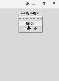
Next TopicPython Tkinter Menu
|