A correlation matrix is a square table that shows the Pearson correlation coefficients between different variables in a dataset.
As a quick refresher, the Pearson correlation coefficient is a measure of the linear association between two variables. It takes on a value between -1 and 1 where:
- -1 indicates a perfectly negative linear correlation between two variables
- 0 indicates no linear correlation between two variables
- 1 indicates a perfectly positive linear correlation between two variables
The further away the correlation coefficient is from zero, the stronger the relationship between the two variables.
This tutorial explains how to create and interpret a correlation matrix in SPSS.
Example: How to Create a Correlation Matrix in SPSS
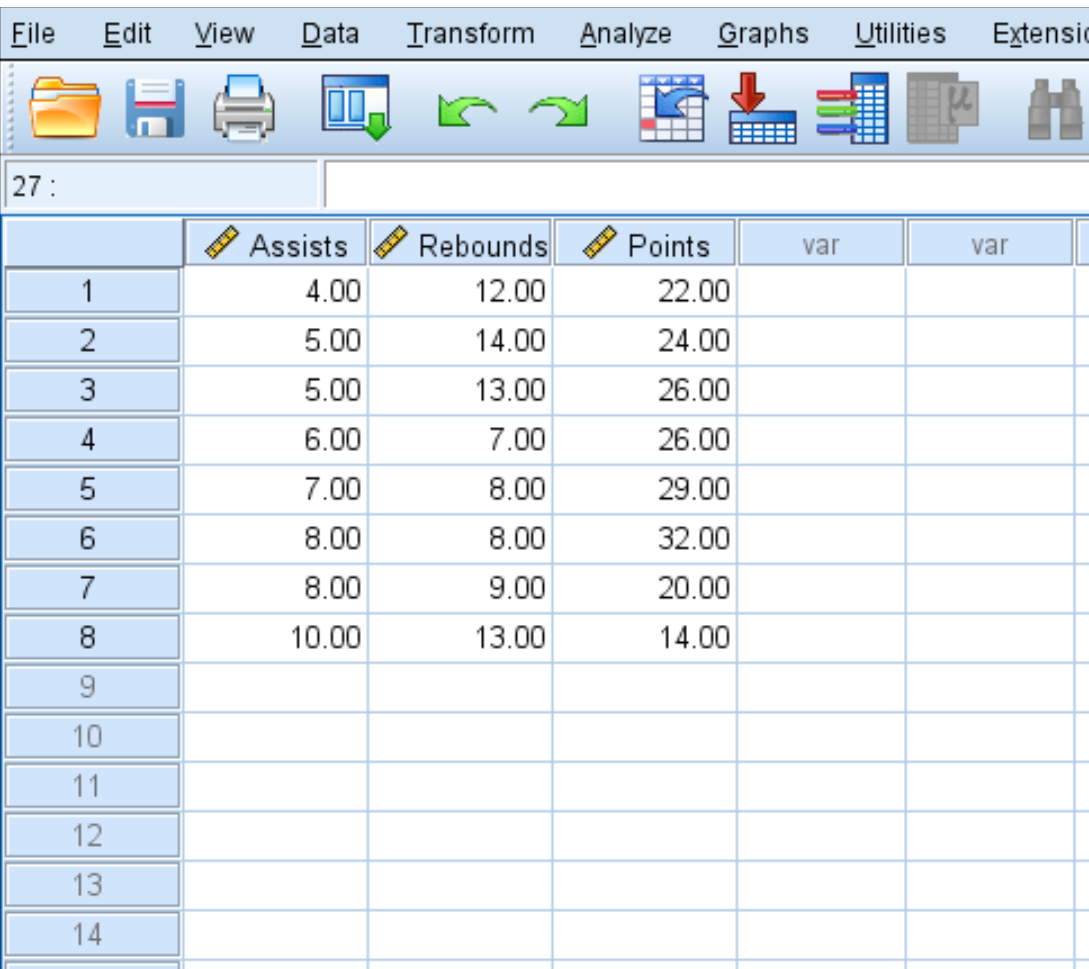
Use the following steps to create a correlation matrix for this dataset that shows the average assists, rebounds, and points for eight basketball players:
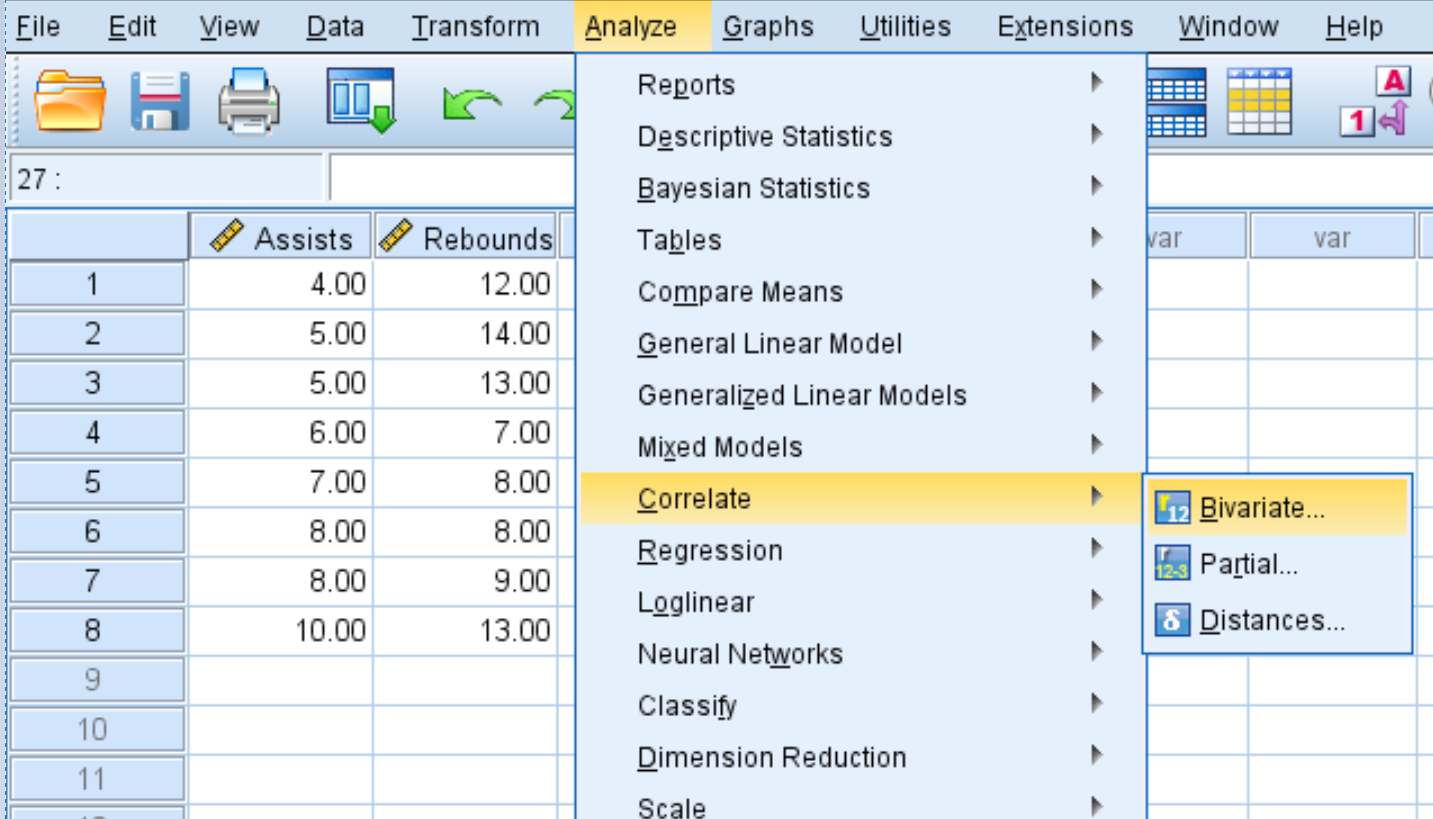
Step 1: Select bivariate correlation.
- Click the Analyze tab.
- Click Correlate.
- Click Bivariate.
Step 2: Create the correlation matrix.
Each variable in the dataset will initially be shown in the box on the left:
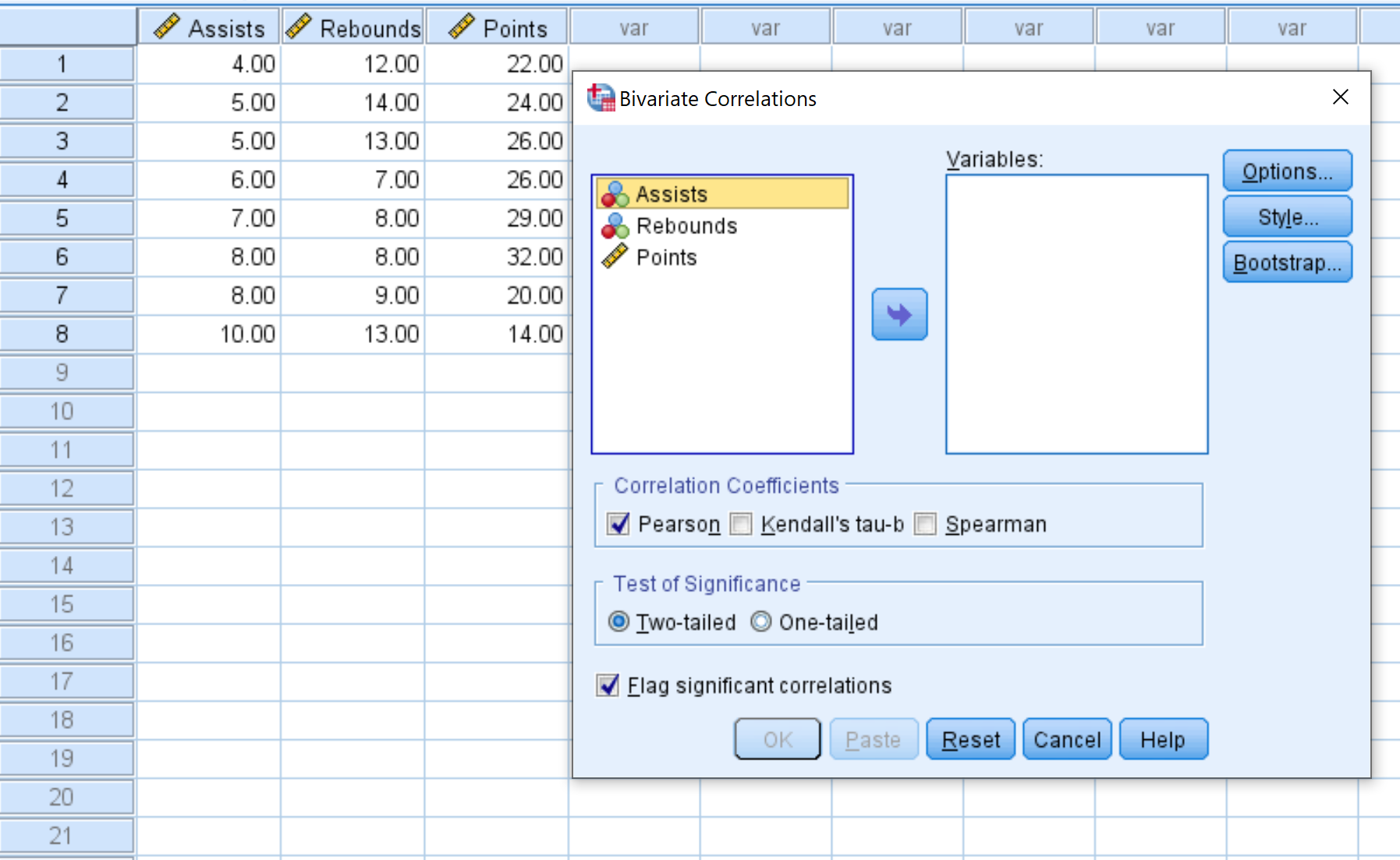
- Select each variable you’d like to include in the correlation matrix and click the arrow to transfer them into the Variables box. We’ll use all three variables in this example.
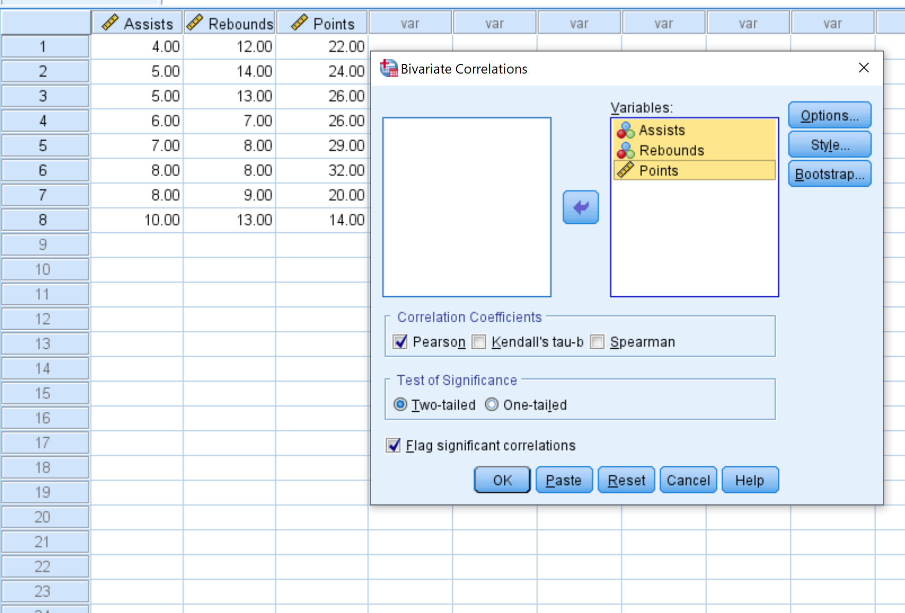
- Under Correlation Coefficients, choose whether you’d like to use Pearson, Kendall’s tau, or Spearman correlation. We’ll leave it as Pearson for this example.
- Under Test of Significance, choose whether to use a two-tailed test or one-tailed test to determine if two variables have a statistically significant association. We’ll leave it as Two-tailed.
- Check the box next to Flag significant correlations if you’d like SPSS to flag variables that are significantly correlated.
- Lastly, click OK.
Once you click OK, the following correlation matrix will appear:
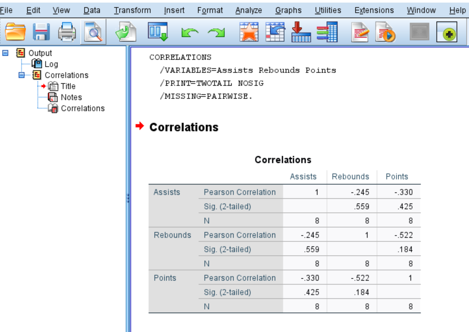
Step 3: Interpret the correlation matrix.
The correlation matrix displays the following three metrics for each variable:
- Pearson Correlation: A measure of the linear association between two variables, ranging from -1 to 1.
- Sig. (2-tailed): The two-tailed p-value associated with the correlation coefficient. This tells you if two variables have a statistically significant association (e.g. if p < 0.05)
- N: The number of pairs used to calculate the Pearson Correlation coefficient.
For example, here’s how to interpret the output for the variable Assists:
- The Pearson correlation coefficient between Assists and Rebounds is -.245. Since this number is negative, it means these two variables have a negative association.
- The p-value associated with the Pearson correlation coefficient for Assists and Rebounds is .559. Since this value is not less than 0.05, the two variables don’t have a statistically significant association.
- The number of pairs used to calculate the Pearson correlation coefficient was 8 (e.g. 8 pairs of players were used in this calculation).
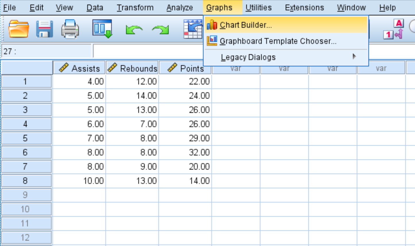
Step 4: Visualize the correlation matrix.
You can also create a scatterplot matrix to visualize the linear relationship between each of the variables.
- Click the Graphs tab.
- Click Chart Builder.
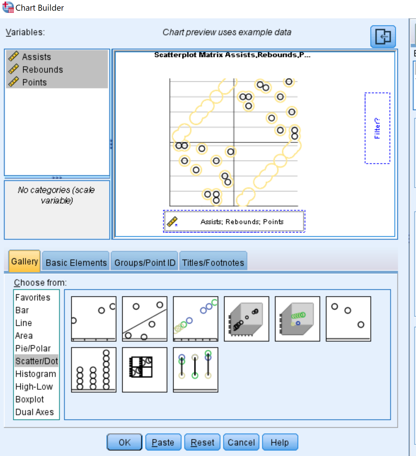
- For chart type, click Scatter/Dot.
- Click the image that says Scatterplot matrix.
- In the Variables box in the top left, hold Ctrl and click on all three variable names. Drag them to the box along the bottom of the chart that says Scattermatrix.
- Lastly, click OK.
The following scatterplot matrix will automatically appear:
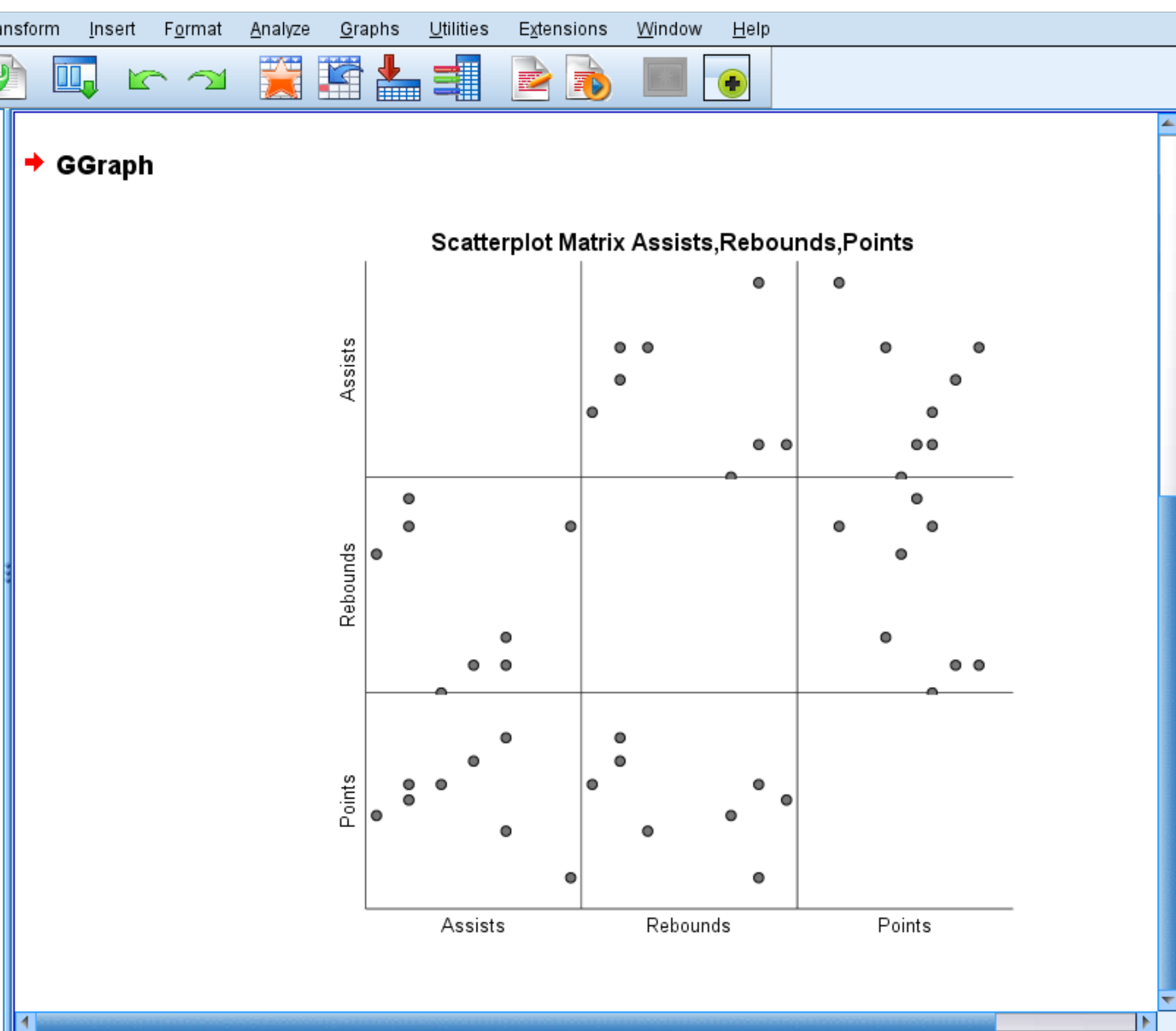
Each individual scatterplot shows the pairwise combinations between two variables. For example, the scatterplot in the bottom left corner shows the pairwise combinations for Points and Assists for each of the 8 players in the dataset.
A scatterplot matrix is optional, but it does offer a nice way to visualize the relationship between each pairwise combination of variables in a dataset.