One way to quantify the relationship between two variables is to use the Pearson correlation coefficient, which is a measure of the linear association between two variables.
It has a value between -1 and 1 where:
- -1 indicates a perfectly negative linear correlation between two variables
- 0 indicates no linear correlation between two variables
- 1 indicates a perfectly positive linear correlation between two variables
The further away the correlation coefficient is from zero, the stronger the relationship between the two variables.
But in some cases we want to understand the correlation between more than just one pair of variables.
In these cases, we can create a correlation matrix, which is a square table that shows the the correlation coefficients between several pairwise combination of variables.
This tutorial explains how to create and interpret a correlation matrix in Excel.
How to Create a Correlation Matrix in Excel
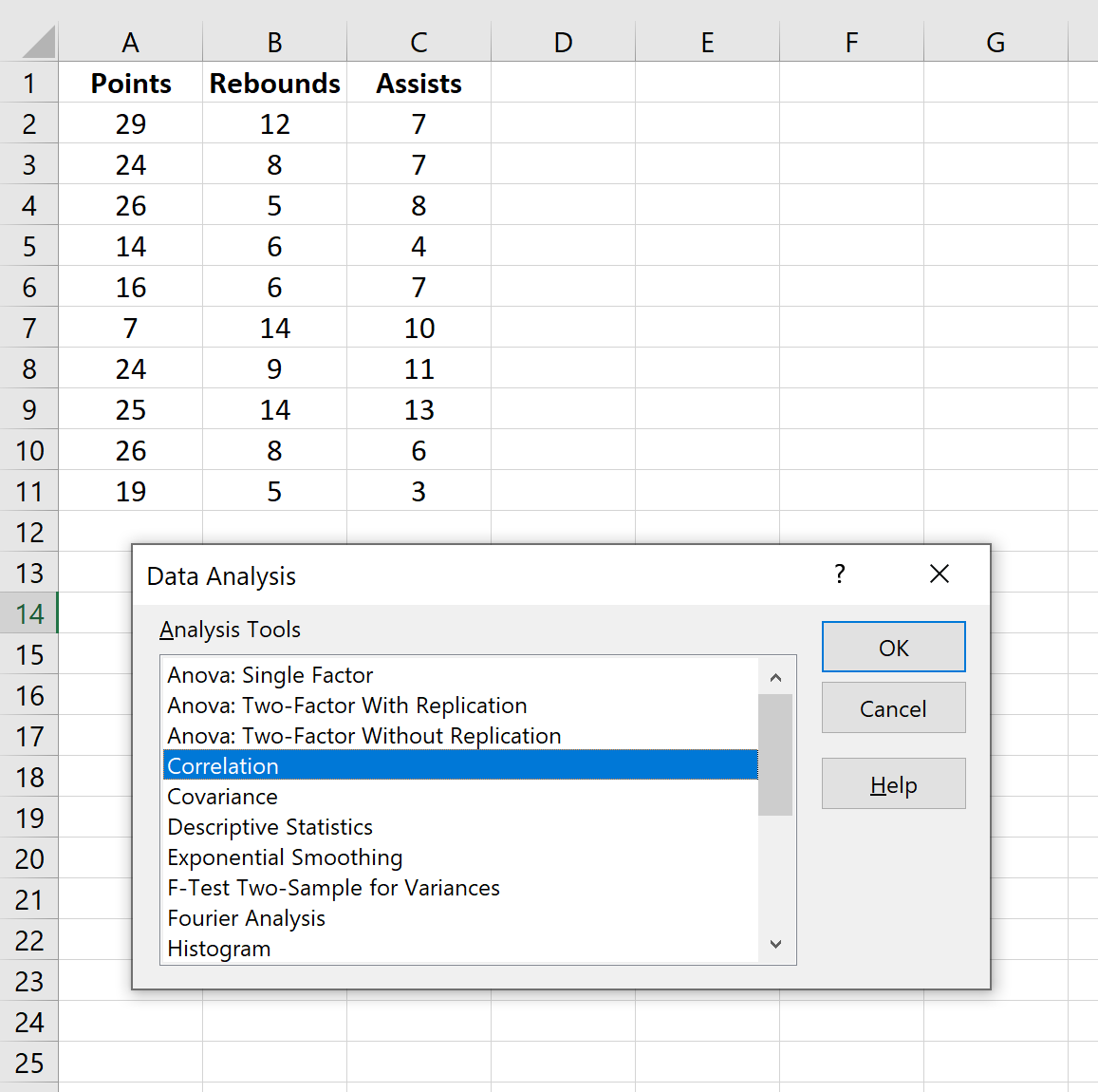
Suppose we have the following dataset that shows the average numbers of points, rebounds, and assists for 10 basketball players:

To create a correlation matrix for this dataset, go to the Data tab along the top ribbon of Excel and click Data Analysis.
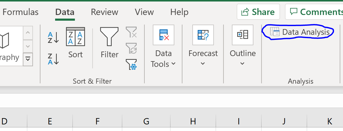
If you don’t see this option, then you need to first load the free Data Analysis Toolpak in Excel.
In the new window that pops up, select Correlation and click OK.
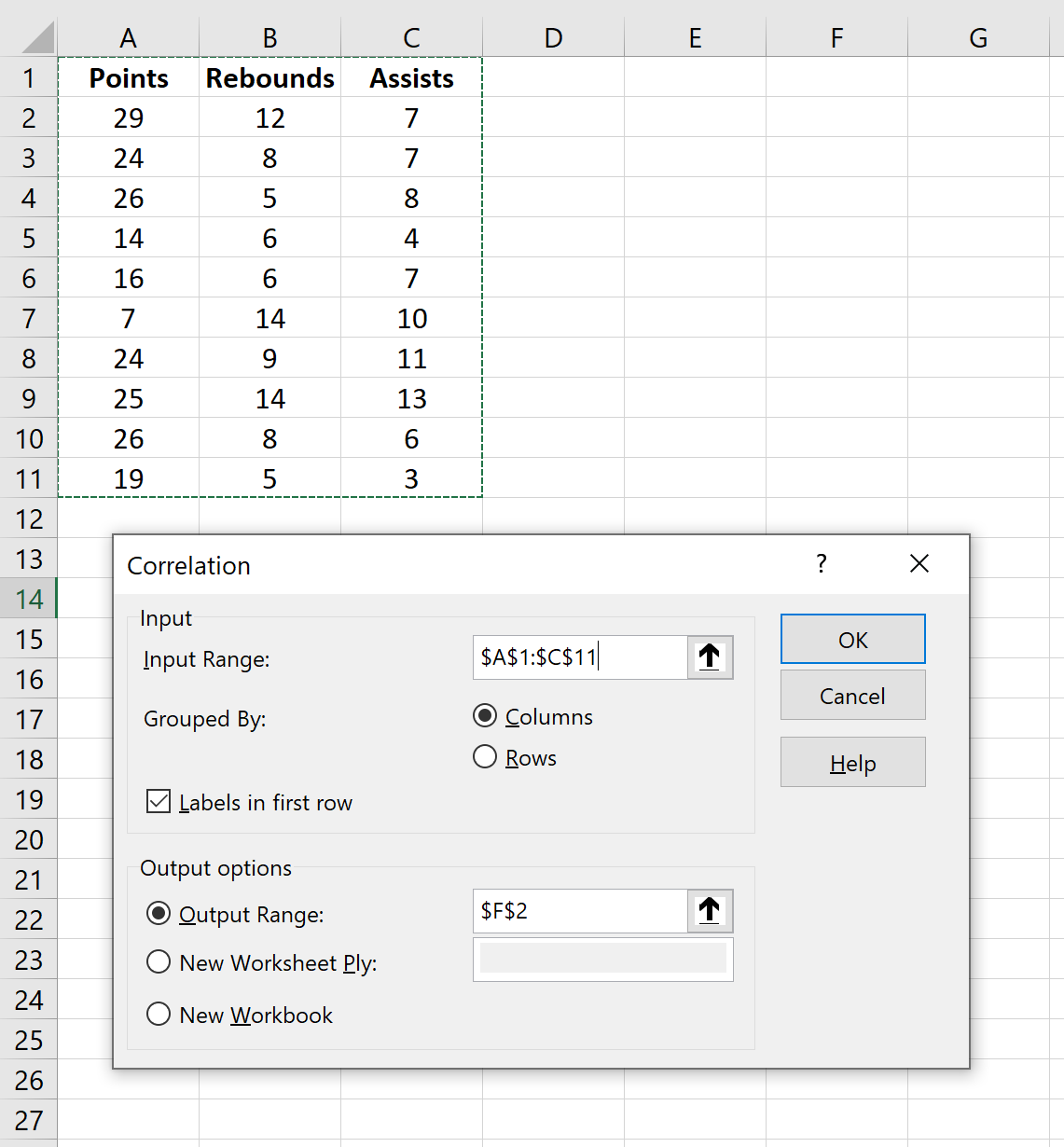
For Input Range, select the cells where the data is located (including the first row with the labels). Check the box next to Labels in first row. For Output Range, select a cell where you’d like the correlation matrix to appear. Then click OK.
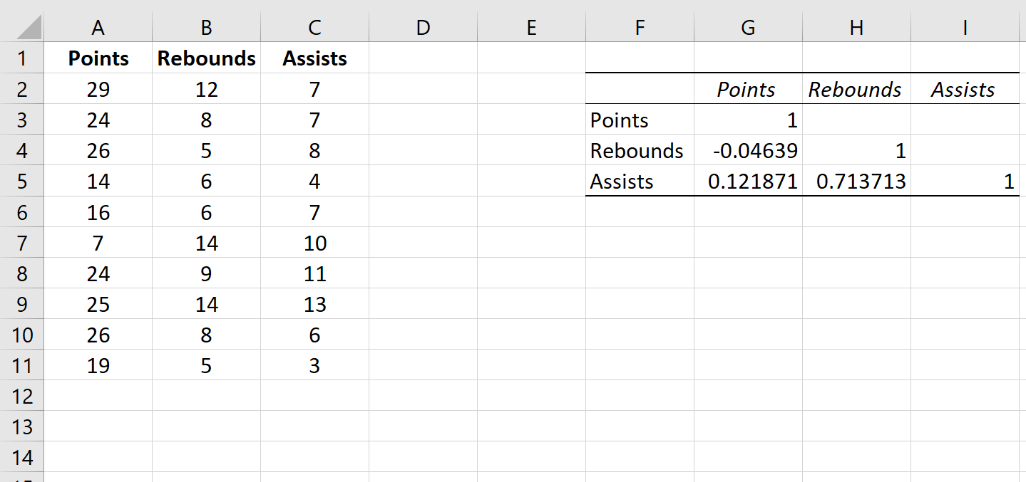
This will automatically produce the following correlation matrix:
How to Interpret a Correlation Matrix in Excel
The values in the individual cells of the correlation matrix tell us the Pearson Correlation Coefficient between each pairwise combination of variables. For example:
Correlation between Points and Rebounds: -0.04639. Points and rebounds are slightly negatively correlated, but this value is so close to zero that there isn’t strong evidence for a significant association between these two variables.
Correlation between Points and Assists: 0.121871. Points and assists are slightly positively correlated, but this value also is fairly close to zero so there isn’t strong evidence for a significant association between these two variables.
Correlation between Rebounds and Assists: 0.713713. Rebounds and assists are strongly positively correlated. That is, players who have more rebounds also tend to have more assists.
Notice that the diagonal values in the correlation matrix are all equal to 1 because the correlation between a variable and itself is always 1. In practice, this number isn’t useful to interpret.
Bonus: Visualizing Correlation Coefficients
One easy way to visualize the value of the correlation coefficients in the table is to apply Conditional Formatting to the table.
Along the top ribbon in Excel, go to the Home tab, then the Styles group.
Click Conditional Formatting Chart, then click Color Scales, then click the Green-Yellow-Red Color Scale.
This automatically applies the following color scale to the correlation matrix:
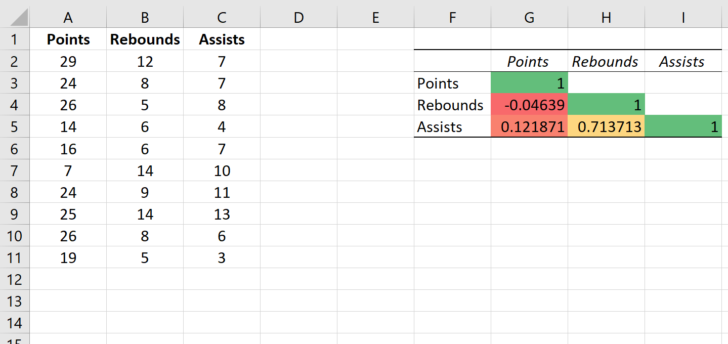
This helps us easily visualize the strength of the correlations between the variables.
This is a particularly helpful trick if we’re working with a correlation matrix that has a lot of variables because it helps us quickly identify the variables that have the strongest correlations.
Related: What is Considered to Be a “Strong” Correlation?
Additional Resources
The following tutorials explain how to perform other common tasks in R:
How to Create a Scatterplot Matrix in Excel
How to Perform a Correlation Test in Excel