Occasionally you may want to add a target line to a graph in Excel to represent some target or goal.
This tutorial provides a step-by-step example of how to quickly add a target line to a graph in Excel.
Step 1: Create the Data
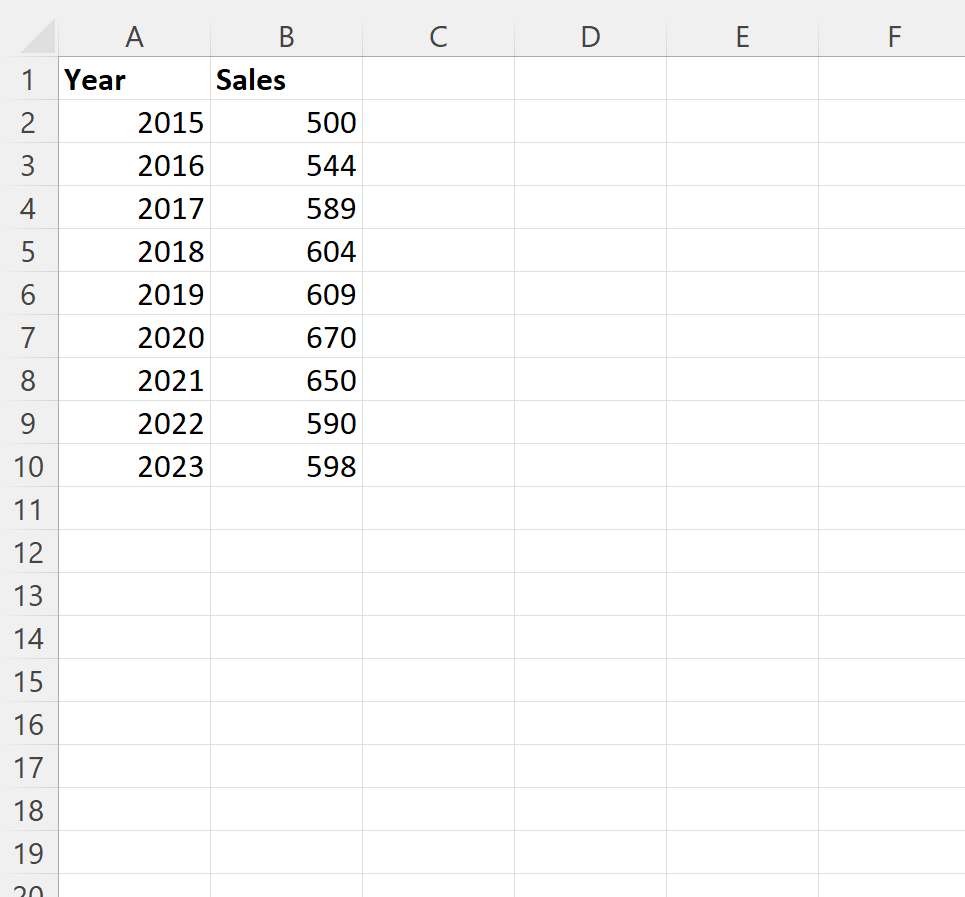
First, let’s create the following dataset that shows the total sales made by some company during various years:
Step 2: Add the Target Value
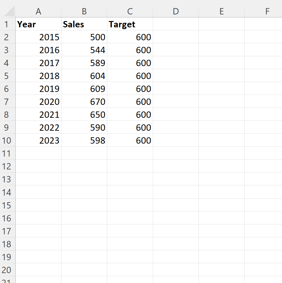
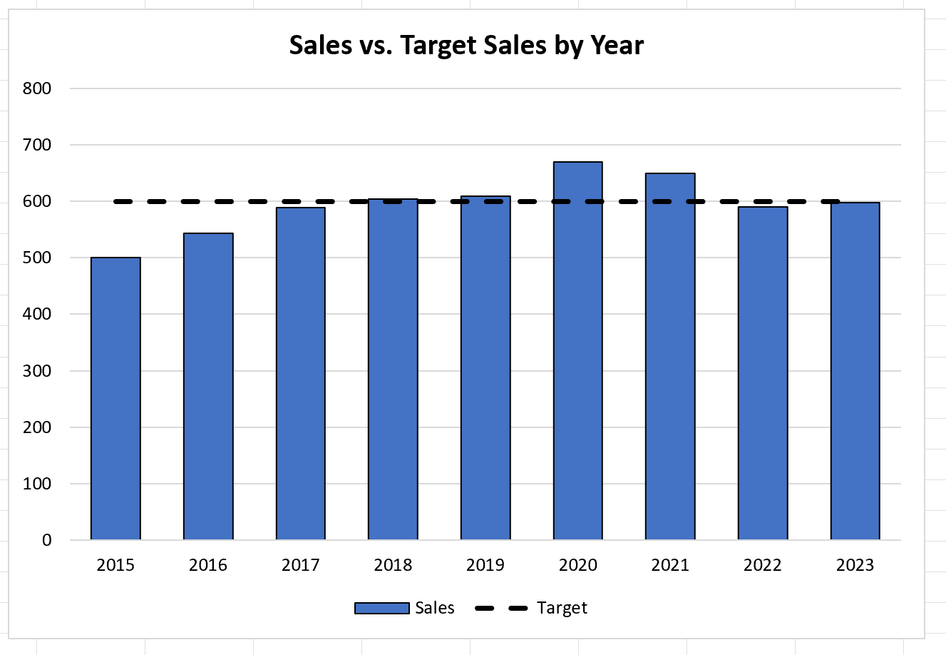
Now suppose that our target value for sales each year is 600.
To add this target line to a chart, we need to first create a target column that contains the value 600 in each row:
Step 3: Create the Graph with Target Value
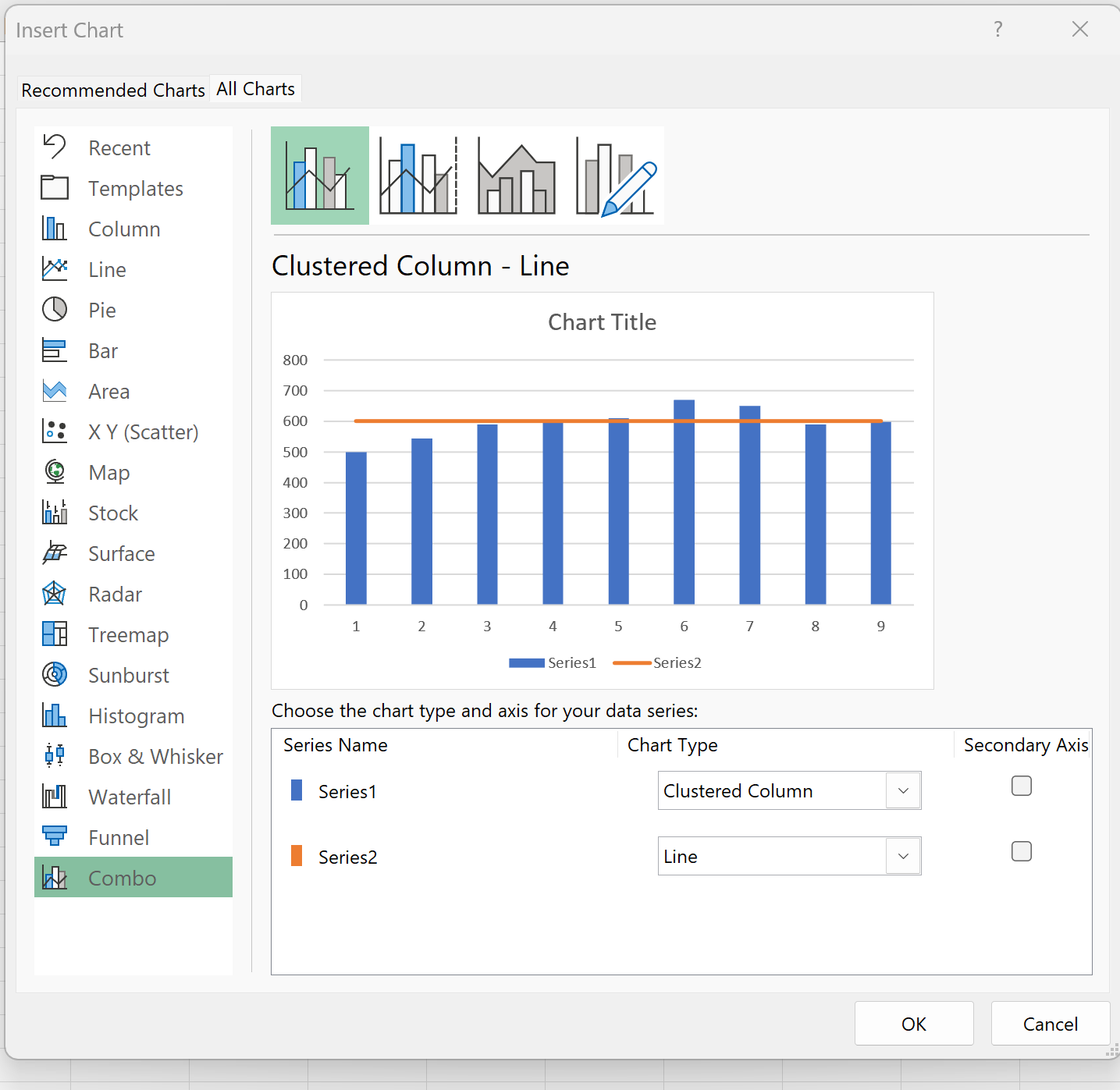
Next, highlight the cells in the range B2:C10, then click the Insert tab, then click the icon called Recommended Charts within the Charts group.
In the new window that appears, click the tab called All Charts near the top and then click Combo:
Once you click OK, a bar graph with a target value will appear:
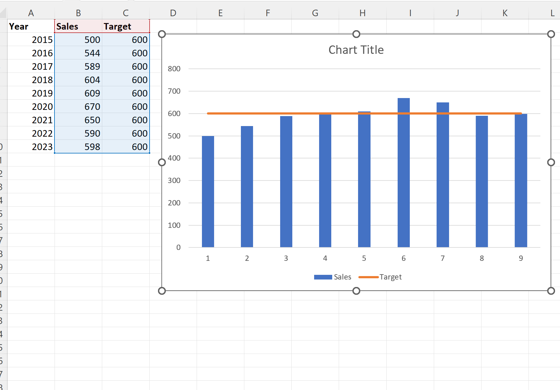
The blue bars represent the sales values for each year and the orange line represents the target sales value of 600 for each year.
Step 4: Customize the Graph (Optional)
Lastly, feel free to modify the colors, the style of the target line, and the axis labels to make the graph more aesthetically pleasing:
The graph is now complete.
Additional Resources
The following tutorials explain how to perform other common tasks in Excel:
How to Add Average Line to Bar Chart in Excel
How to Add a Horizontal Line to a Scatterplot in Excel
How to Add a Vertical Line to Charts in Excel