A frequency polygon is a type of chart that helps us visualize a distribution of values.

This tutorial explains how to create a frequency polygon in Excel.
Example: Frequency Polygon in Excel
Use the following steps to create a frequency polygon.
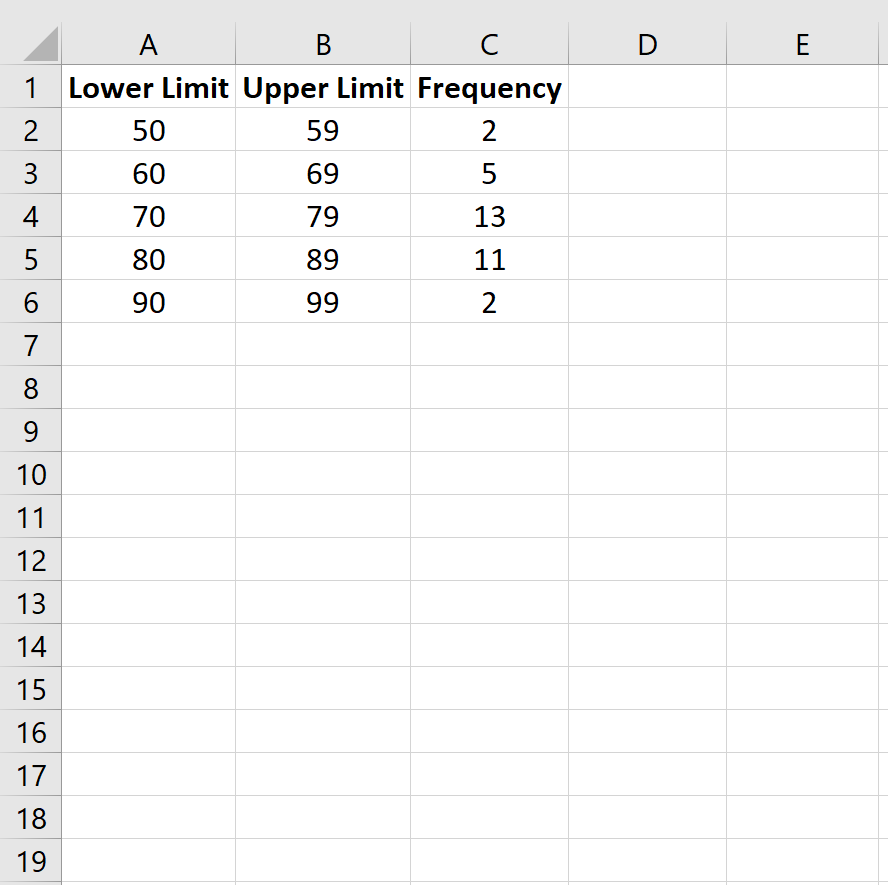
Step 1: Enter the data for a frequency table.
Enter the following data for a frequency table that shows the number of students who received a certain score on an exam:
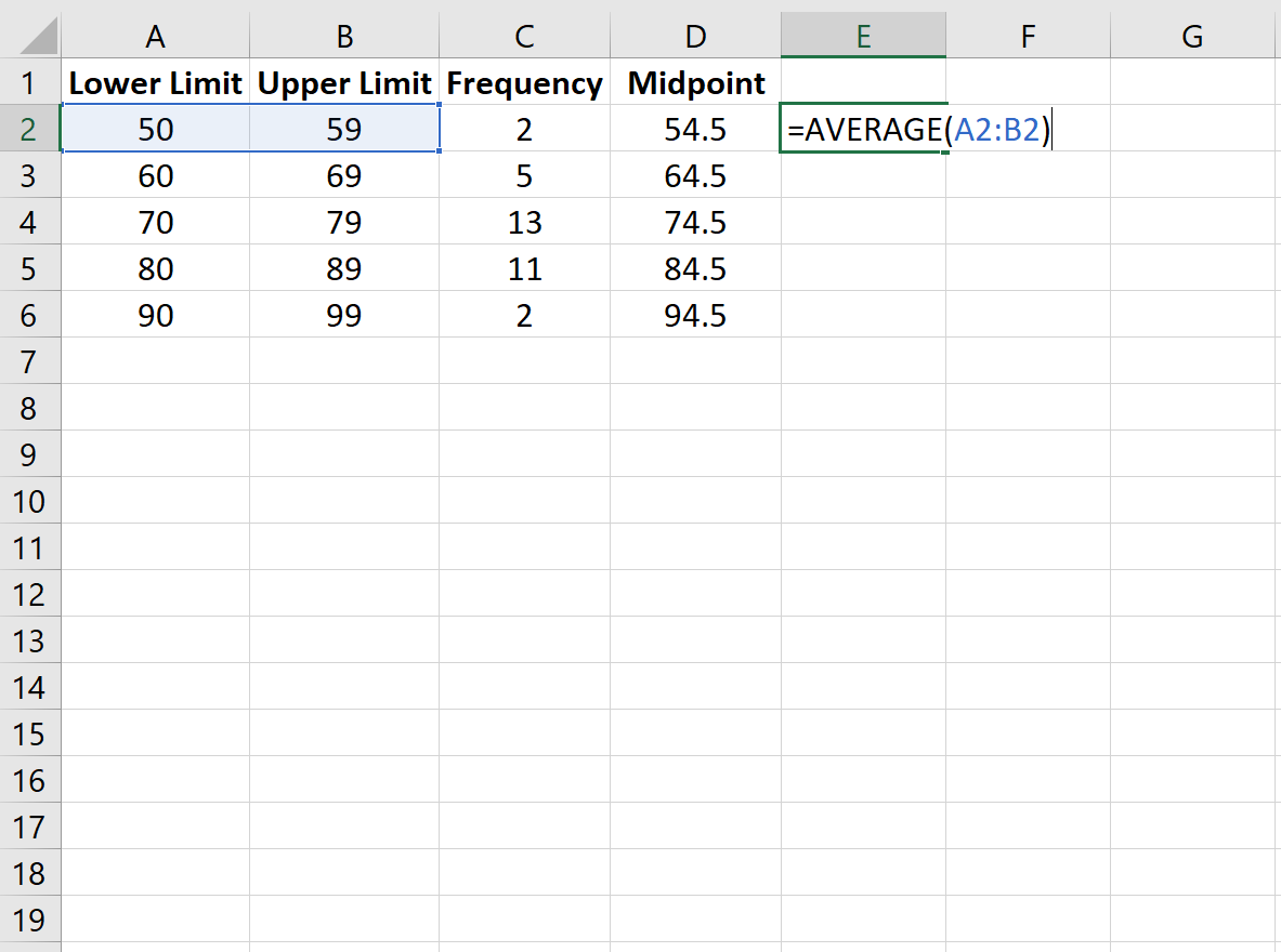
Step 2: Find the midpoint of each class.
Next, use the =AVERAGE() function in Excel to find the midpoint of each class, which represents the middle number in each class:
Step 3: Create the frequency polygon.
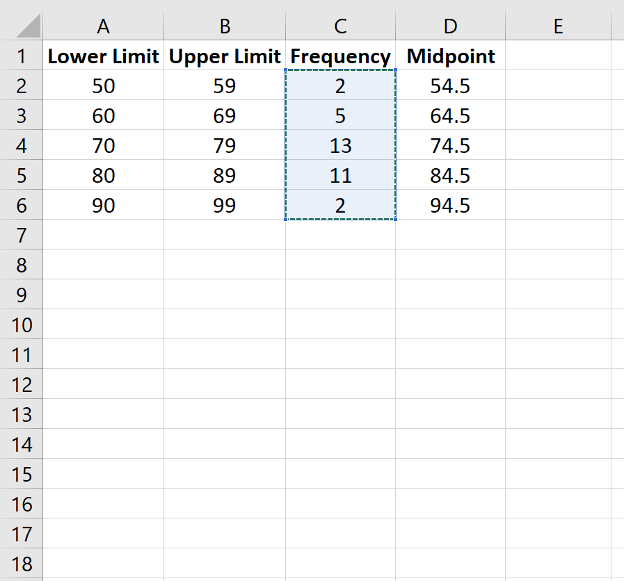
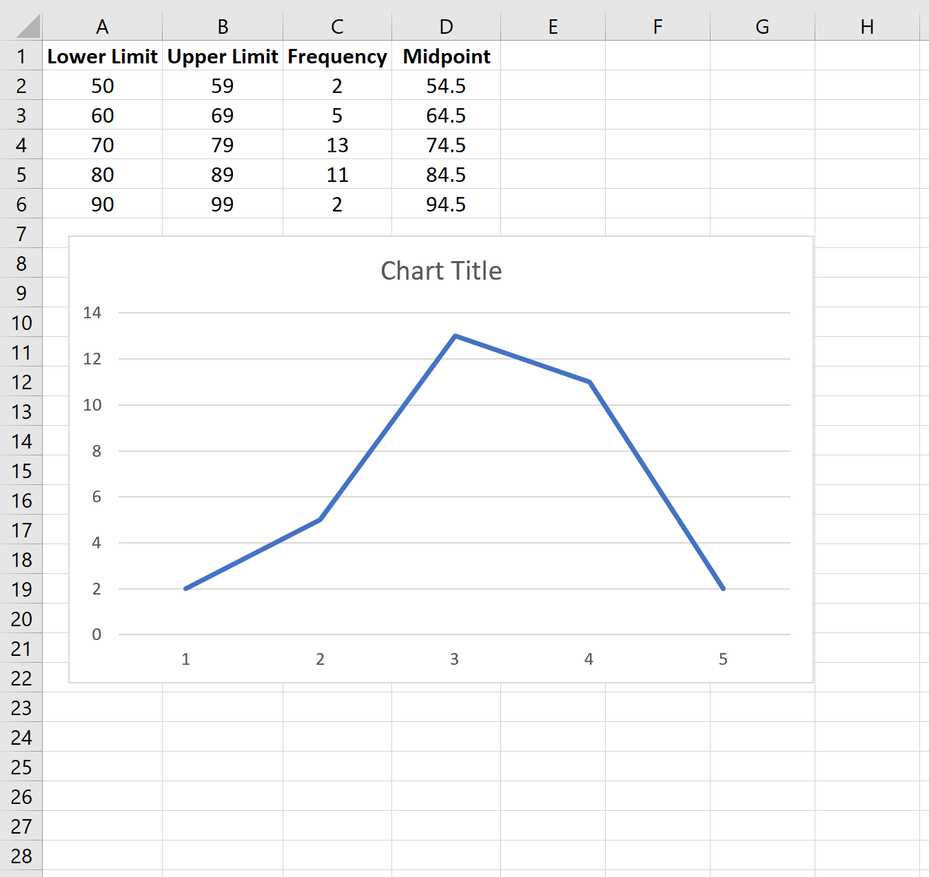
Next, we will create the frequency polygon. Highlight the frequency values in column C:
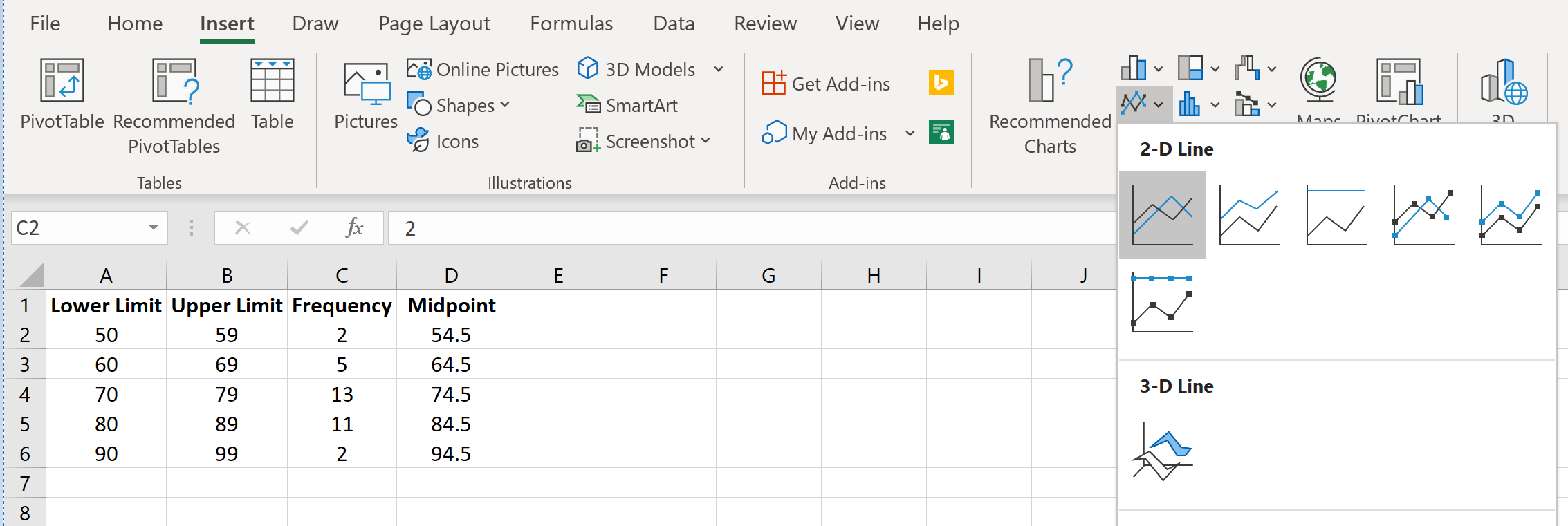
Then go to the Charts group in the Insert tab and click the first chart type in Insert Line or Area Chart:
A frequency polygon will automatically appear:
To change the x-axis labels, right click anywhere on the chart and click Select Data. A new window will pop up. Under Horizontal (Category) Axis Labels click Edit and type in the cell range that contains the Midpoint values. Click OK and the new axis labels will automatically appear:
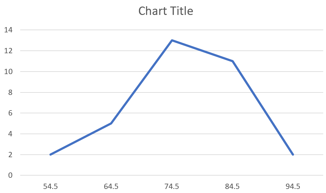
Feel free to modify the chart title, add axis labels, and change the color of the plot to make it more aesthetically pleasing.
From the frequency polygon we can easily see that most students scored in the 70s and 80s, with a few scoring in the 60s and even less scoring in the 50s and the 90s.