React CSS CSS in React is used to style the React App or Component. The style attribute is the most used attribute for styling in React applications, which adds dynamically-computed styles at render time. It accepts a JavaScript object in camelCased properties rather than a CSS string. There are many ways available to add styling to your React App or Component with CSS. Here, we are going to discuss mainly four ways to style React Components, which are given below:
- Inline Styling
- CSS Stylesheet
- CSS Module
- Styled Components
1. Inline Styling The inline styles are specified with a JavaScript object in camelCase version of the style name. Its value is the style?s value, which we usually take in a string. Example App.js
Note: You can see in the above example, we have used two curly braces in:
Hello JavaTpoint!.
It is because, in JSX, JavaScript expressions are written inside curly braces, and JavaScript objects also use curly braces, so the above styling is written inside two sets of curly braces {{}}. Output  camelCase Property Name If the properties have two names, like background-color, it must be written in camel case syntax. Example App.js
Output  Using JavaScript Object The inline styling also allows us to create an object with styling information and refer it in the style attribute. Example App.js
Output 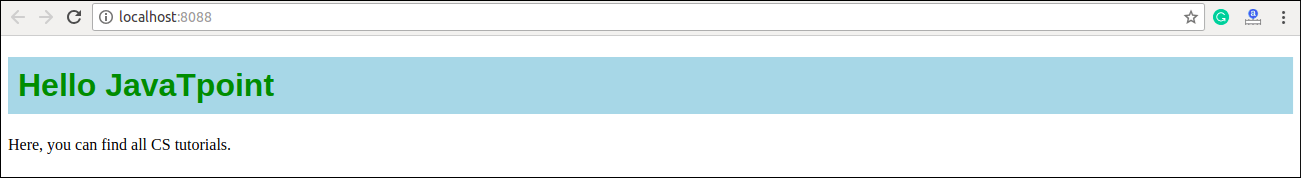 2. CSS Stylesheet You can write styling in a separate file for your React application, and save the file with a .css extension. Now, you can import this file in your application. Example App.js
App.css
Index.html
Output 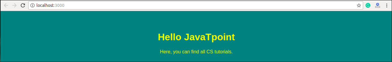 3. CSS Module CSS Module is another way of adding styles to your application. It is a CSS file where all class names and animation names are scoped locally by default. It is available only for the component which imports it, means any styling you add can never be applied to other components without your permission, and you never need to worry about name conflicts. You can create CSS Module with the .module.css extension like a myStyles.module.css name. Example App.js
myStyles.module.css
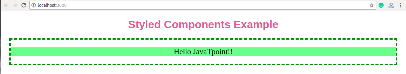
Output 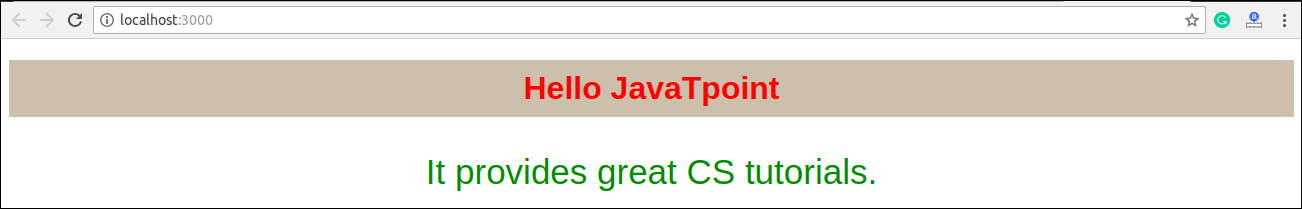 4. Styled Components Styled-components is a library for React. It uses enhance CSS for styling React component systems in your application, which is written with a mixture of JavaScript and CSS. The styled-components provides:
- Automatic critical CSS
- No class name bugs
- Easier deletion of CSS
- Simple dynamic styling
- Painless maintenance
Installation The styled-components library takes a single command to install in your React application. which is:
Example Here, we create a variable by selecting a particular HTML element such as , </strong>, and <strong><paragraph></strong> where we store our style attributes. Now we can use the name of our variable as a wrapper <strong><Div></Div></strong> kind of React component.</p> <p><strong>App.js</strong></p>
<div class="codeblock">
<textarea name="code" class="java">
import React from 'react';
import ReactDOM from 'react-dom';
import styled from 'styled-components';
class App extends React.Component {
render() {
const Div:any = styled.div`
margin: 20px;
border: 5px dashed green;
&:hover {
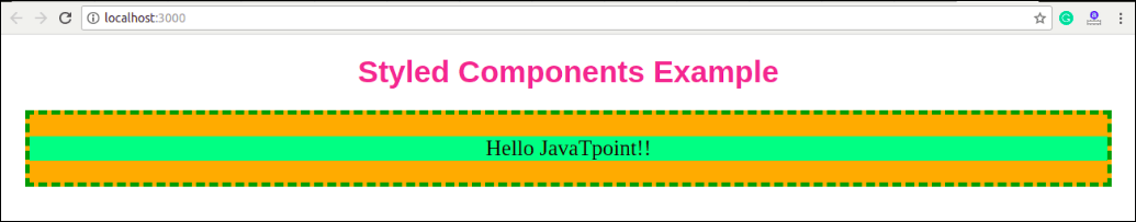
background-color: ${(props:any) => props.hoverColor};
}
`;
const Title = styled.h1`
font-family: Arial;
font-size: 35px;
text-align: center;
color: palevioletred;
`;
const Paragraph = styled.p`
font-size: 25px;
text-align: center;
background-Color: lightgreen;
`;
return (
<div>
<Title>Styled Components Example
|