You can easily plot multiple lines on the same graph in Excel by simply highlighting several rows (or columns) and creating a line plot.
The following examples show how to plot multiple lines on one graph in Excel, using different formats.
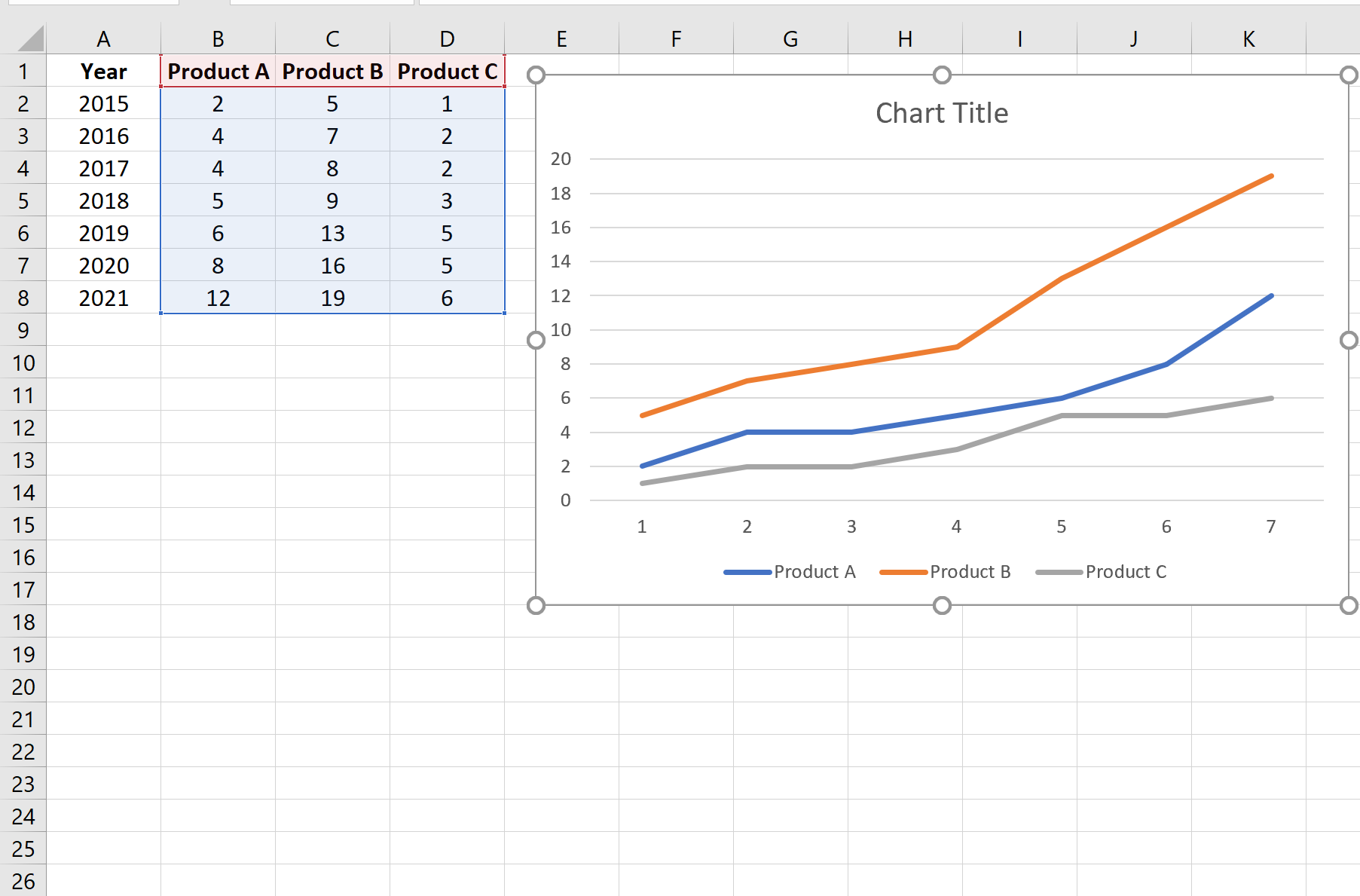
Example 1: Plot Multiple Lines with Data Arranged by Columns
Suppose we have the following dataset that displays the total sales for three different products during different years:

We can use the following steps to plot each of the product sales as a line on the same graph:
- Highlight the cells in the range B1:D8.
- Click the Insert Tab along the top ribbon.
- In the Charts group, click the first chart option in the section titled Insert Line or Area Chart.
The following chart will appear:
Example 2: Plot Multiple Lines with Data Arranged by Rows
Suppose we have the following dataset that displays the total sales for three different products during different years, arranged by rows:

We can use the following steps to plot each of the product sales as a line on the same graph:
- Highlight the cells in the range A1:H4.
- Click the Insert Tab along the top ribbon.
- In the Charts group, click the first chart option in the section titled Insert Line or Area Chart.
The following chart will appear:

Example 3: Plot Multiple Lines with Flipped Columns & Rows
Suppose we have the following dataset that displays the total sales for four different products during two different years:

We can use the following steps to plot each of the product sales as a line on the same graph:
- Highlight the cells in the range A1:C5.
- Click the Insert Tab along the top ribbon.
- In the Charts group, click the first chart option in the section titled Insert Line or Area Chart.
The following chart will appear:

Notice that the products are displayed along the x-axis instead of the years.
To switch the rows and columns, we can click anywhere on the chart and then click the Switch Row/Column button under the Chart Design tab:

Once we click this button, the rows and columns will be switched and the years will be displayed along the x-axis:

Additional Resources
How to Create a Stem-and-Leaf Plot in Excel
How to Create a Dot Plot in Excel
How to Create Side-by-Side Boxplots in Excel
How to Create an Ogive Graph in Excel