A candlestick chart is a type of financial chart that displays the price movements of securities over time.
The following example shows how to create a candlestick chart using the Matplotlib visualization library in Python.
Example: Creating a Candlestick Chart in Python
Suppose we have the following pandas DataFrame that shows the open, close, high, and low price of a certain stock during an 8-day period:
import pandas as pd

#create DataFrame
prices = pd.DataFrame({'open': [25, 22, 21, 19, 23, 21, 25, 29],
                       'close': [24, 20, 17, 23, 22, 25, 29, 31],
                       'high': [28, 27, 29, 25, 24, 26, 31, 37],
                       'low': [22, 16, 14, 17, 19, 18, 22, 26]},
                       index=pd.date_range("2021-01-01", periods=8, freq="d"))

#display DataFrame
print(prices)

            open  close  high  low
2021-01-01    25     24    28   22
2021-01-02    22     20    27   16
2021-01-03    21     17    29   14
2021-01-04    19     23    25   17
2021-01-05    23     22    24   19
2021-01-06    21     25    26   18
2021-01-07    25     29    31   22
2021-01-08    29     31    37   26
We can use the following code to create a candlestick chart to visualize the price movements of this stock during this 8-day period:
import matplotlib.pyplot as plt
#create figure
plt.figure()
#define width of candlestick elements
width = .4
width2 = .05
#define up and down prices
up = prices[prices.close>=prices.open]
down = prices[prices.closeopen ]
#define colors to use
col1 = 'green'
col2 = 'red'
#plot up prices
plt.bar(up.index,up.close-up.open,width,bottom=up.open,color=col1)
plt.bar(up.index,up.high-up.close,width2,bottom=up.close,color=col1)
plt.bar(up.index,up.low-up.open,width2,bottom=up.open,color=col1)
#plot down prices
plt.bar(down.index,down.close-down.open,width,bottom=down.open,color=col2)
plt.bar(down.index,down.high-down.open,width2,bottom=down.open,color=col2)
plt.bar(down.index,down.low-down.close,width2,bottom=down.close,color=col2)
#rotate x-axis tick labels
plt.xticks(rotation=45, ha='right')
#display candlestick chart
plt.show() 
Each candlestick represents the price movement of the security on a particular day. The color of the candlestick tells us whether the price closed higher (green) or lower (red) than the previous day.
Feel free to change the widths of the candlesticks and the colors used to make the chart appear however you’d like.
For example, we could make the candles even skinnier and use different colors to represent ‘up’ and ‘down’ days:
import matplotlib.pyplot as plt
#create figure
plt.figure()
#define width of candlestick elements
width = .2
width2 = .02
#define up and down prices
up = prices[prices.close>=prices.open]
down = prices[prices.closeopen ]
#define colors to use
col1 = 'black'
col2 = 'steelblue'
#plot up prices
plt.bar(up.index,up.close-up.open,width,bottom=up.open,color=col1)
plt.bar(up.index,up.high-up.close,width2,bottom=up.close,color=col1)
plt.bar(up.index,up.low-up.open,width2,bottom=up.open,color=col1)
#plot down prices
plt.bar(down.index,down.close-down.open,width,bottom=down.open,color=col2)
plt.bar(down.index,down.high-down.open,width2,bottom=down.open,color=col2)
plt.bar(down.index,down.low-down.close,width2,bottom=down.close,color=col2)
#rotate x-axis tick labels
plt.xticks(rotation=45, ha='right')
#display candlestick chart
plt.show() 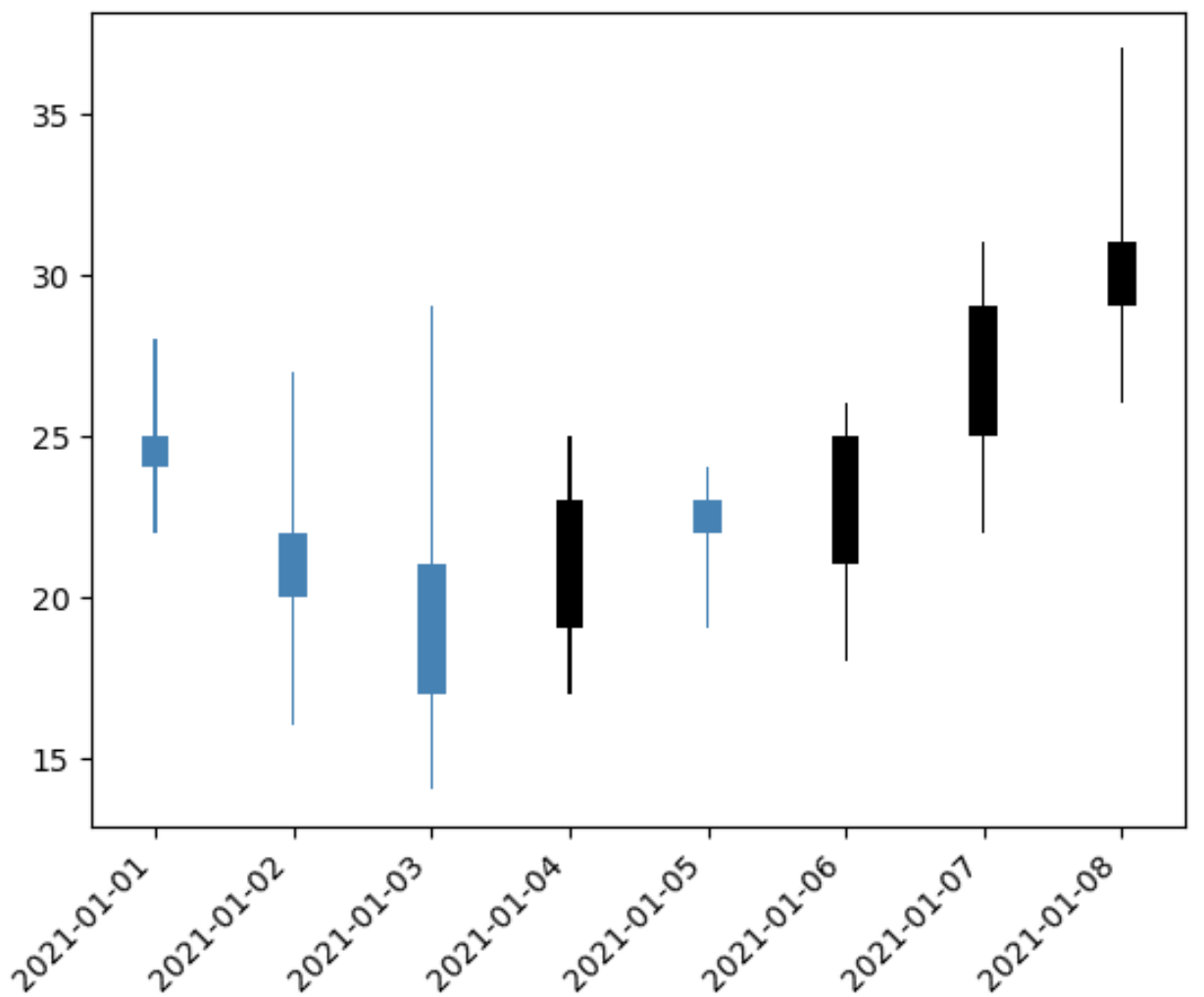
Additional Resources
The following tutorials explain how to create other common charts in Python:
How to Create Multiple Matplotlib Plots in One Figure
How to Plot Histogram from List of Data in Python
How to Create Boxplots by Group in Python